Design decisions should be clear and carried out boldly to avoid giving a ‘weird’ feel
Spotifygate
Spotify got some backlash a while ago when they made a subtle change in their logo. Personally winced at my windows tray when something looked off with my Spotify logo…
Here’s the delta from a screencap:

Now, most people probably appreciate the new logo and slightly ‘flatter’ color tone, but that’s not the point. The change was so subtle that many people didn’t have the reaction ‘KEWL LOGO UPDATE!’ but instead they probably thought ‘IZ MY MONITOR BROKE?’
That was my reaction, I really wondered for a second if my monitor was on the fritz because of the logo change.
According to the TNW article (found via the great Brand New) Spotify has big design changes planned. They also commented that they “didn’t communicate it clearly”. I think that’s the issue, miscommunication, and it’s not that it required a press release, but rather that the change itself didn’t communicate well on its own.
Intentionality
One opinion I’ve formed in the (short) time I’ve worked in design is that your decisions should be clear and not wishy-washy. What do I mean? compare these 2 screnshots:
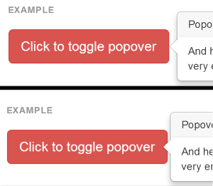
This is from bootstrap documentation for the popover. The top popover is the default style, where the popover ‘arrow’ sits right next to the trigger element. The screnshot below shows a slight modification where the arrow sits on top of the trigger element. Why the modification? The overlapping style creates a stronger indication of the relationship between the popover and the trigger, also its visually easier to pick up because of the contrast in this case. The top (default) version just sets the popover next to the trigger, and doesn’t quite make a decision “Am I gonna hover to the side, or sit on top of the trigger? hmm…” Whereas in the modified example, its more obvious “Yup, I’m a popover, and I CAME FROM this trigger element right here, right under my arrow!”
It’s just my opinion, but I think that when you make design choices (and similarly develoment choices..) the more explicit you are, the easier it is for the user to follow where you are going and what you are doing.
Maybe this is a reach, but I’d say that in the case of Spotify, if they were going to make ‘big design changes’ they should’ve made it clear with a totally new logo, but by making a small (but still noticable) change, people were confused and couldn’t tell what they were trying to achieve. At least there should have been some other change in conjunction with the color to make it obvious.